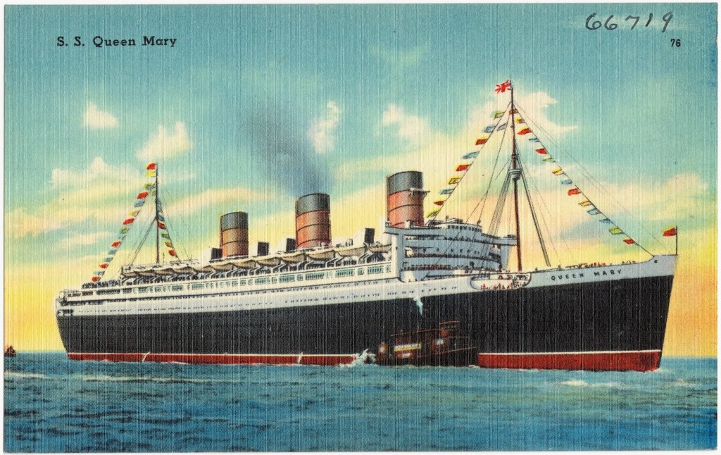
A transatlantic voyage in something as opulent as the H.M.S. Queen Mary conjures images of cocktails on deck, passengers in splendor, and gown trains whispering along a polished floor. We wanted to evoke a period of glamour and sparkle so often seen whenever Agatha Christie jetted Poirot on a luxury holiday. Capturing that elegance theatrically can be a challenge, especially when your budget gives you glass instead of diamonds–or in our case, plastic. But that’s the beauty of human imagination. Ahoy! features beautiful and unique designs that are new to MMP from carved ice swans to our own chandeliers. Learn how we make the stage itself shimmer and shine in this behind-the-seas blog post on the set dressing.
SEA TO SHINING SEA: The Making of Ahoy! (Part 3)

Art Deco was the name of the game for the early 1930’s–then referred to often as Art Moderne. We wanted to capture the clean, graphic appeal of the Chrysler Building into the VFW Ship. Also, with our venue being an entirely landlocked ship in a Mojave Desert city, we needed to find a way to emulate the feeling of the ocean somehow without any actual views of water. Faux portholes designed by Set Designer Regina Troglin will line the walls to allow glimpses of the sea. However, we also employed a sneaky costuming trick. Our gossip ensemble which sit on the permieter of the room have all intentionally been dressed in oceanic colors–blues, greens, teals–with insane jewels sparkling like sun on the surf. This glittering ensemble against the cool green walls of the VFW will subconsciously evoke the colors of the sea. In the set dressing, everything was kept to silvers, blues, and whites to keep the scenery feeling crisp and fresh and Art Deco. Feathers, rhinestones, and just sprinkle of glitter remind us of the fabulous era we set Ahoy! in.
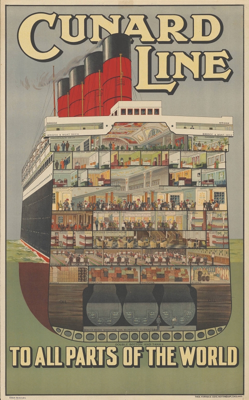
Those were the broad strokes of the scenic design, but we also had story-specific designs to accomplish which really tested our imaginations. We wanted to remember this was a dining lounge onboard a ritzy ocean liner. Also, there were the complications of being performed in the round. You can’t put a couch with a high back in the middle of the stage. You can’t erect a wall in front of the audience. So we designed a suite of “conversation chairs” like you could find in a French salon or other such grand lounges or galleries. Chairs that form a circle of seating so every angle can be utilized. The blocking of the show has the characters move all around these chairs, sitting in each one, so that no matter where you sit, you will get a special view of the show. With the blue iridsescent color-shift glitter and silver legs, these chairs are certainly a centerpiece.
Speaking of centerpieces, we had to make several of them for our tables with one crown jewel of them all: an ice swan. Swannie makes a important story contribution at the end of the show. Making a theatrical ice sculpture (that couldn’t melt) that didn’t involve using a ton of resin was a crazy undertaking. And, naturally, whenever we have something crazy to build, our artists LEAP at the opportunity. Our ice swan was actually finished merely days after we started rehearsals. It will stand proudly on its pedastal next to the Captain’s Table, sparkling in the light from new chandeliers and Art Deco wall sconces.
Below, we interviewed MMP Hall of Fame Artist and superstar artisan prop maker and set dresser, Janis Kunz, about designing and creating some of the jaw-dropping pieces for Ahoy!. Read how she helped conceptualize and how our team of amazing artists created everything from ice swans to chandeliers to ship newspapers.
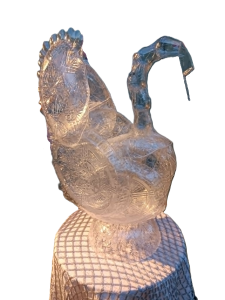
MMP: What were the inspirations, and how did you construct the ice swan?
JK: I love how ice sculptures look! I wanted to emulate that sense of an organic object captured as a frozen moment in time. I looked at pictures of different ice swan sculptures and chose elements that looked cool (pun intended), such as the upward sweep of the wings with the feathers spread. Then I had to decide what material to use, since obviously ice was not an option! Dollar Tree is my go-to think space when constructing props and set dressing out of alternative items. I wander the aisles with the image in my mind and hunt for something with the same shape and color. I grew up on The Littles cartoon along with I Spy and Graeme Base books, so my mind’s eye is primed for the job! I spied clear plastic spoons and thought how they could be the feathers and went from there, picking each shape I needed from other clear plastic items to build up the swan’s wings, neck, and body. Sometimes it is just serendipity to find an item that fits your need, like the ice scoop for the swan’s face and bill. I thought that was fitting! The rest was just a game of building it up like a 3-D puzzle and fastening each piece in place until the full sculpture emerged.
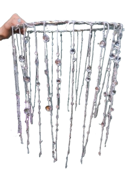
MMP: Tell us about the design of the chandeliers.
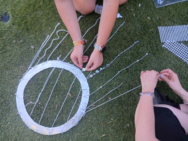
JK: The chandeliers were a main element from the beginning during director Daniel Stallings’ and my discussions of set dressing. What fancy ocean liner lounge would be complete without resplendent crystal chandeliers? We wanted elegance and sparkle, grandeur and glitter! They also had to be something we could place easily and temporarily in the VFW Ship. So the idea came about to encircle the four pre-existing light fixtures across the ceiling with chandelier costumes, as it were. The set dressing crew worked diligently creating the base collars that will be hung up and stringing the strings with hundreds of plastic crystals.
MMP: How about the wall sconces?
JK: Art deco is a favorite design of mine and any time I can work in art deco, I’m happy! I wanted to bring some of the glamour of the dressing that was on the ceiling and the tables to the wall, while keeping it streamlined. So a simple cardboard and silver tape construction evoking the skyscraper styles of the 1930’s did the trick!

MMP: And the table lamps?
JK: Again, elegance and glamour were key. As well as the theme of ocean colors, so keeping to blues, white and silver. Olivia Holm-Risden, who plays Lola Langford, showed me the idea of table decor with big white feathers, and I thought that looked very cool! So I sourced some white feathers and played around with ways of how to display them on the tables. I landed on the idea of having them fan out of a short silver vase, which had a kind of quill in a jar vibe to it that I liked, but also a palm frond shape that bespoke of exotic island destinations one could sail to on a luxury ocean liner. White ostrich feathers also brought in the look of flashy stage costumes of the 1930’s – something that matched with certain characters in Ahoy! These vases balanced nicely with the lamps we had planned and would form our centerpieces for each of the five audience tables. The lamps themselves are designed to be part of the set lighting as well, so the lights inside will be on for the show. The lamps are recommissioned from ones we built for 2025’s Murder at the Red Fez, an MMP show that I worked on as set dressing crew. The blood-red lampshades from Red Fez were swapped out for watery-blue ones, and voila! In my mind this puts the two plays in the same universe, like maybe the speakeasy and the ocean liner got their lamps from the same manufacturer. I mean, why not? After all, there is a cameo of a Red Fez character in Ahoy!, so they must coexist. Fun connections like that between shows always thrill me!
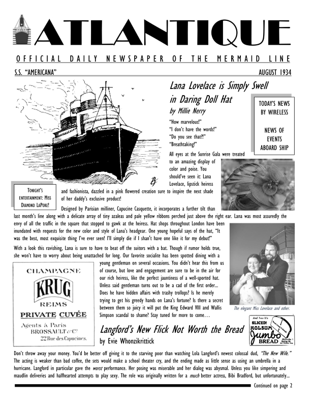
MMP: To create the world of the play for the audience, we decided that a ship newspaper–something seen on cruises to this day and something very popular in the age of luxury liners–was needed on the tables to provide additional in-universe context for the world of Ahoy!. Tell us the story of designing and writing for the ship’s newspaper, Atlantique.
JK: Being tasked to create copy for the ocean liner’s newspaper was great! I find I work better when given a specific vessel to fill with content; it inspires and challenges me. And this content stemmed directly from the humorous script itself. The asides given throughout the show, such as stolen jewels, an actress’ questionable project, or Lana Lovelace making a front page splash when she wears a new hat, were ripe fodder for going tongue in cheek for the Atlantique. I enjoyed writing a scathing review as if it was from the rival actress, coming up with the colorful history of the main macguffin of the play–the Cape necklace–and going all gossip rag about Lana and her new beau. I chose to use pun byline names for the articles, a la Carmen Sandiego villains, because that is just plain fun! It was nice to be able to free my imagination and embellish the world of Ahoy! with these little extras. The final layout design by Daniel Stallings is just lovely! I think the vintage ads are the icing on top and it will be a cute piece for audience to peruse at their tables! It really adds to the immersion of the play and feeling like you are on board this ocean liner in the 1930’s.
As gossipy socialite Sasha Steinberg says to guests, “Every jewel needs its proper setting to sparkle best.” And we hope the set of Ahoy! provides that perfect setting for our guests. Speaking of jewels, just how many can an actor wear anyway? How many tiaras does a show need? The answer is “Yes.” In a tale centered on jewels in a season of sparkles, the jewelry curation of Ahoy! is one of the most layered yet. Learn about (and see pictures of) our gorgeous jewelry in our next behind-the-seas blog post: Bling-a-ding-ding: The Making of Ahoy! (Part 4).
And grab those tickets before we set sail without you! Tickets are sold here.
Bon voyage!
–Master Mystery Productions
 Master Mystery Productions